
According to Forbes magazine, the Millennial generation’s attention span lasts about 12 seconds, while Gen Z’s is only 8 seconds.
Although Gen X’s attention span is not much longer, it is far less selective. Gen X and baby boomer generations are easier to keep engaged with longer, more comprehensive content, while millennials will lose interest quickly and are prone to multitasking, giving most content only a fraction of their brainpower.
So what does this mean as a Shopify store owner? Let me give it to you straight...
They won't take the time to search for an “About Us” or “Our Mission” page to learn what you stand for or why you exist.
But, they DO want to make an impact through their purchases. 88% of them actually.
Which is why it’s crucial to highlight social impact directly in the product buying journey.
Direct-to-consumer eCommerce brands need to be thinking more fast-paced than ever before. If today’s customers are not captivated by a brand within a single click, they are out the door. Byeee!
How causes play into this: Gen Z are fiercely passionate about human rights and environmental issues, such as climate change, fast fashion, and the elimination of harmful materials such as excessive plastic. So, they look to the brands they buy from to reflect that perspective in their core values.
McKinsey & Co actually says that 70% of Gen Z’ers try to purchase products from companies they consider ethical and 80% refuse to buy goods from companies involved in scandals or ethical controversies.
They want to know how their products are made and if they support their ethics and beliefs. And it’s not an option, it’s a foundation to their purchasing habits. But, there's a new trend you need to understand to really assess how to communicate being ethical and sustainable as a Shopify store. And that is: Slacktivism.
How The New Trend of Slacktivism Affects Your Website
Slacktivism is the practice of supporting a political or social cause by means such as social media or online petitions, characterized as involving very little effort. We always like to say that Millennials and Gen Z are passionate activists, but the reality is, they're often only activists to the point of it not requiring too much effort. Hence the name "slacktivists."
Due to its low cost and noncommittal style, this new wave of activism has gained itself a bad reputation. However, it represents a lucrative opportunity to quickly capture your customer’s attention in the eCommerce buying journey with opportunities to engage in social impact.
For your brand’s social impact story to truly be successful, a company's call to action (CTA) needs to transcend actions of digital activism and encourage their consumers to do more.
The call to action SHOULD consist of: ability to vote with their dollar and purchase (or give) a product that creates a clear impact (like purchasing this pair of sneakers = saves 30 bottles from the ocean). Or offer carbon emission shipping offsets (either for you or your consumer to do), opportunities to donate, and even opportunities to volunteer (but that one's harder in a COVID world).
The call to action should NOT consist of: empty offers to round up their purchase to a charity of their choice, like with other popular give-back apps on Shopify. You know why I don't support this approach? Because yeah it helps to provide donations to charities, but it does literally nothing to the long term brand love image!
It doesn't connect the consumer on any deeper level to what it is that particular brand stands for. It allows one consumer to donate to puppies in a rescue shelter and another to donate to women's education. And both bought sneakers. Where's the connection? There is none. This approach is a cop-out and a red flag to younger consumers indicating the brand really doesn't stand for anything at all.
That's not to say brands who are earlier in their journeys can't get started with social impact messaging on their site. It just needs to be done in a way that is honest that they're early. Because consumers will see right through it and accuse you of green-washing.
Another reason this is so important is when we look at the typical bounce rate of ecommerce sites today- which hovers between 60-70%. Basically, you didn’t capture their attention quickly enough, so they left. Usually, the most common page for consumers to bounce from is the home screen.
Top Changes You Should Make to Your Site To Share Your Social Mission In The Core Buying Journey
- Immediately feature your social mission on the home page: In order to capture your audience’s attention on that first click, you need to feature your social mission right away. “About Us” or “Our Mission” statements should be seen immediately on the home page, but more importantly, featured throughout the entire on-site buying journey...
- Add social impact into your site navigation: Gen Z consumers will not take the time to find an “About Us” section in your navigation, especially if it’s at the bottom of the site or on a hidden tab. A good place to start improving your site is to change up your navigation to feature your mission more prominently. Some leading social impact brands are categorizing their product navigation according to their social mission, impact, sustainable material type, or even factories where products were produced. One of our customers at Because, Bird & Stone, does a really good job at this.
- Avoid separate “About Us” pages: Finally, the most advanced way to change your site and make sure you’re catering to today’s Millennial & Slacktivist trends, is to feature your key impact numbers throughout the whole site. From the home page, to the product grid, the product details pages (PDP). Also don’t forget to include details in the shopping cart, order review, customer loyalty accounts, and even post purchase follow-ups. Here are some tips to get you started.
- Home page - Break down the work you do with simple analogies. Millennials and Gen Z want to understand the process of your social impact, not just a list of buzzwords that give your company a pat on the back. Make sure you have a “How it works” or “What we do to help” explanation so that your audience can see the work you’re doing towards achieving your social mission, one step at a time.
Example - Ettitude (call out of their social mission on core home page)

- Product Grid - Use engaging graphics and eye-catching statistics to break up your product grid for a more cause focused shopping experience. This will remind your customers that their dollars will make a difference.
Example - The Hunger Site (social impact card replacing one of the products)

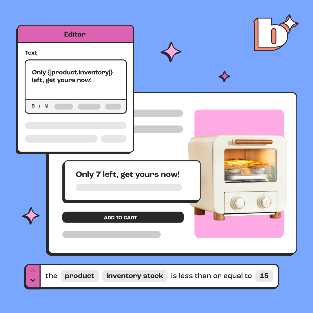
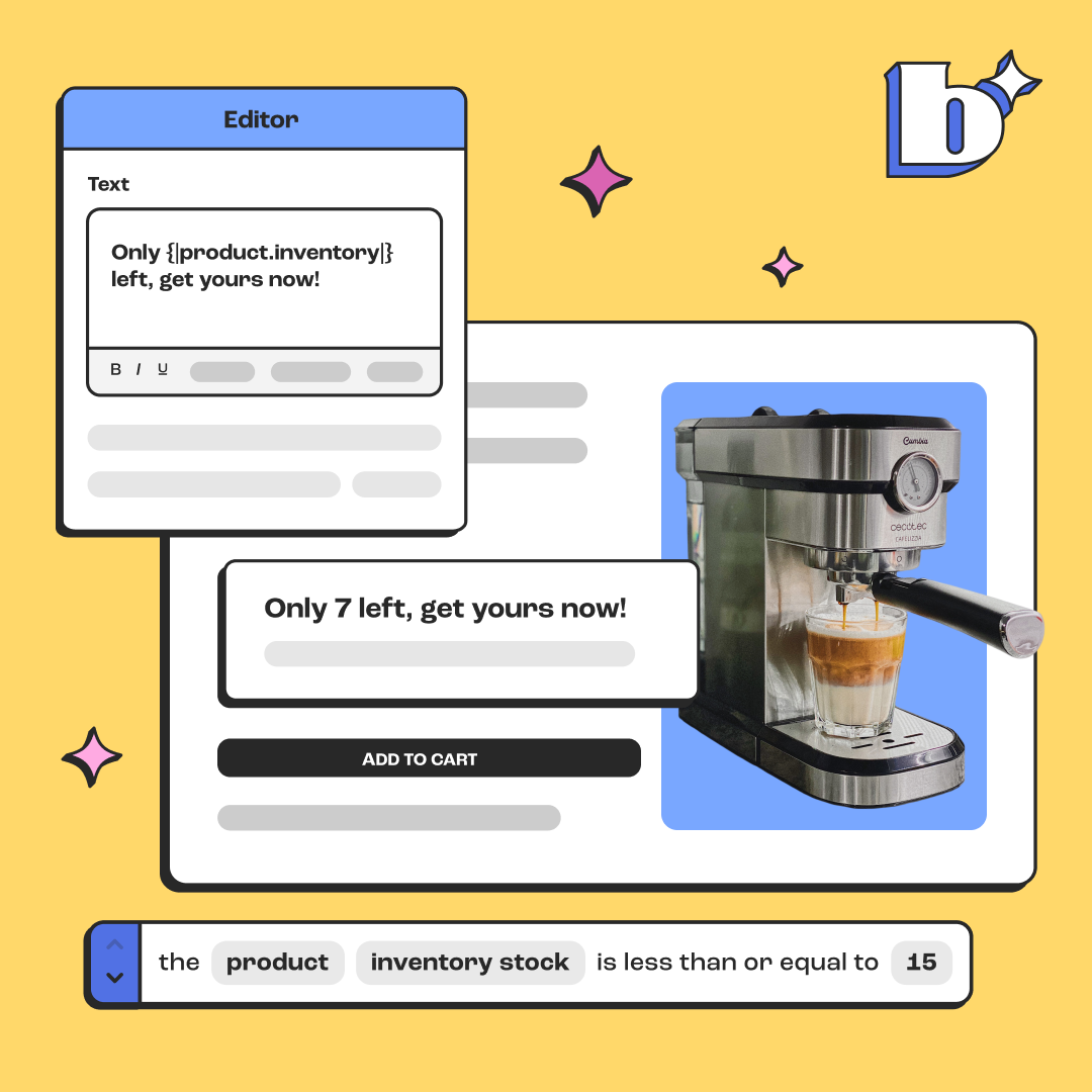
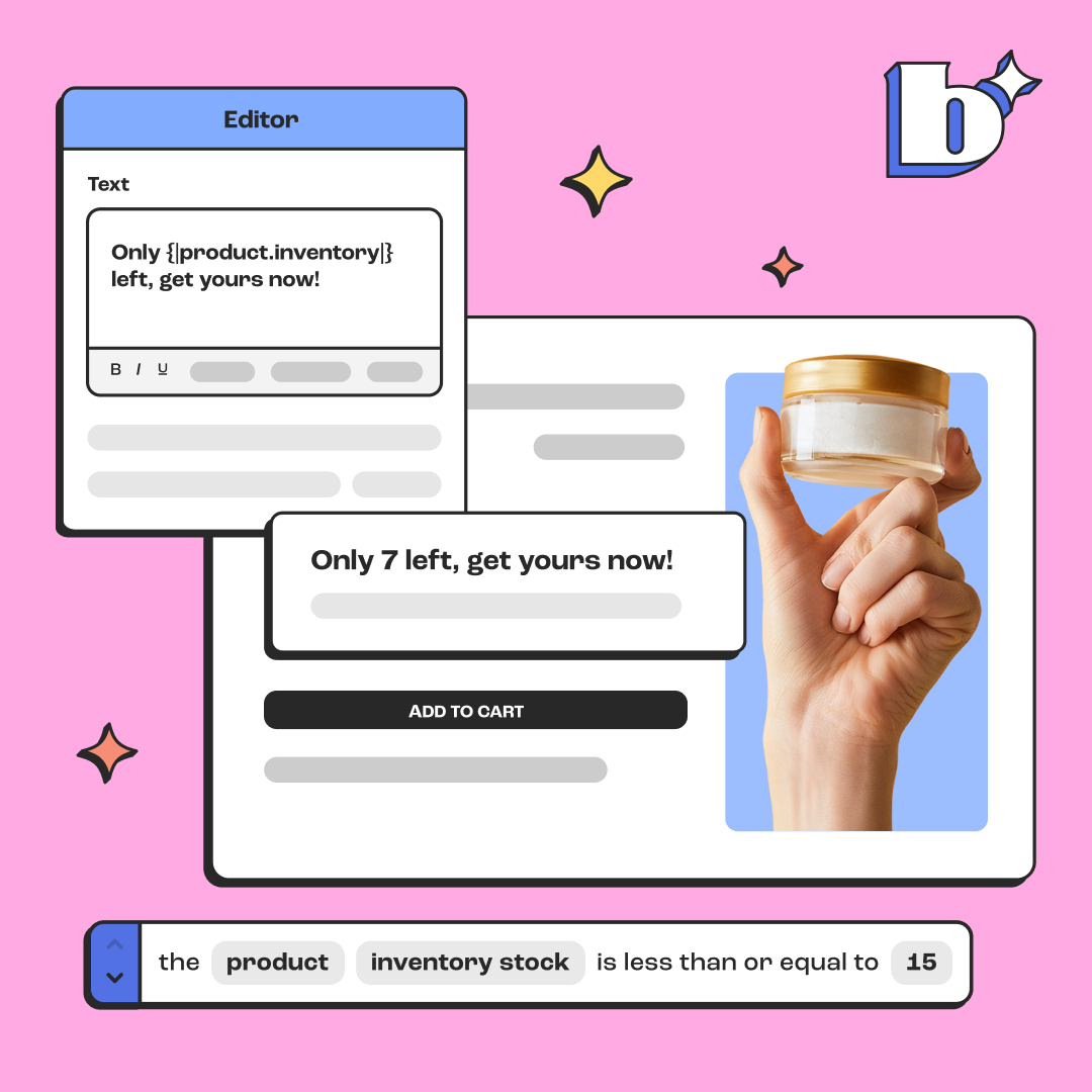
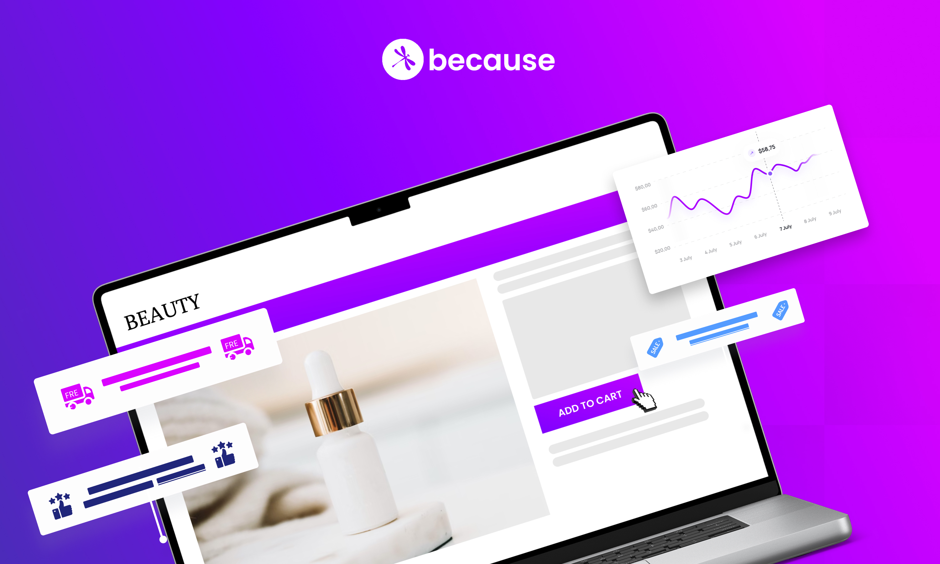
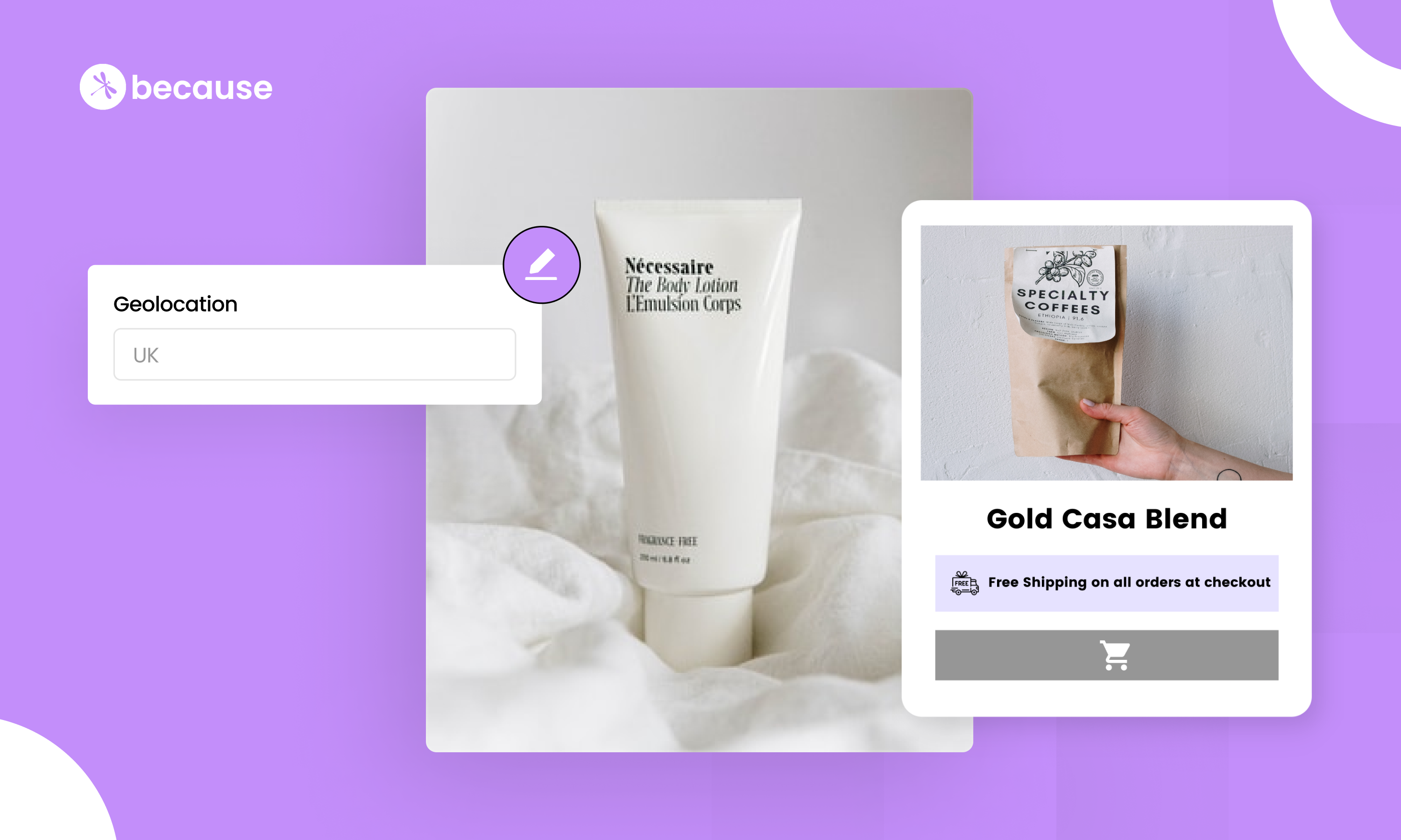
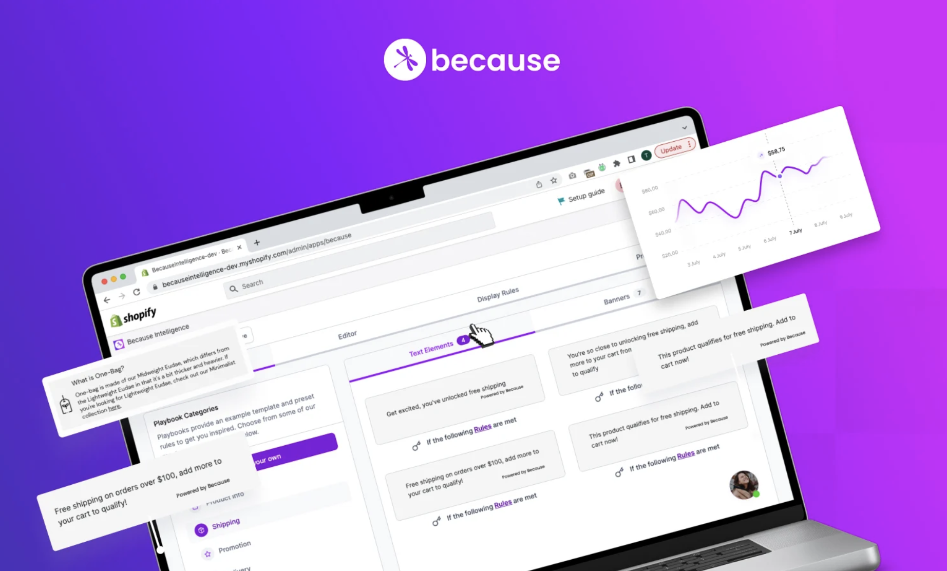
- Product Detail Page - Weave in the impact of your social mission to your product detail page. Avoid falling victim to the tl;dr (too long; didn’t read) by using simple language and stating the product benefits right away. (We have to do a little plug for Because on this one as we just launched on sites like Hanx and Shameless Pets to better explain social impact on the PDP!)
Example - Hanx (social impact banner above "add to bag" button- using Because)

Example - Shameless Pets (social impact banner above "add to cart" button- using Because)

- Shopping Cart - The average cart abandonment rate is 77%. One way to make your cart page stand out and reduce cart abandonment is by reinforcing your social mission at that final step. Target potentially socially conscious shoppers by continuing to involve your social mission in the whole buying journey. Remind them using statistics, impact metrics, and imagery on why their purchase will make a difference in the world. But make sure it's subtle and not distracting, especially as they get closer and closer to purchase! NEVER link them away from purchase to another page, and try to avoid annoying pop-ups. Millennials hate those.
Example - Easy Period (social impact banner in cart- using Because)

We know there's a market of dedicated, cause-focused consumers out there. The only thing left to do is to engage their minds and purchasing habits. We hope these guidelines will help you do just that.


.png)
.png)

.png)

.png)
.jpeg)
.jpeg)
.jpeg)
.jpeg)
%20(1).png)
.webp)


